Using illustrations for building user-centered tech brand

When I was working on the brand and product for Cherdak, one of the main challenges was creating a sense of trust, especially since the service deals with storing people’s personal belongings. One of the solutions was a photoshoot that clearly showed how the service works: pickup, delivery, and storage. These images became part of the brand and now live on the homepage of the website.

But photography alone wasn’t enough. There were many parts of the product where visuals were still needed to build that same sense of confidence, and where using photos just wasn’t practical.
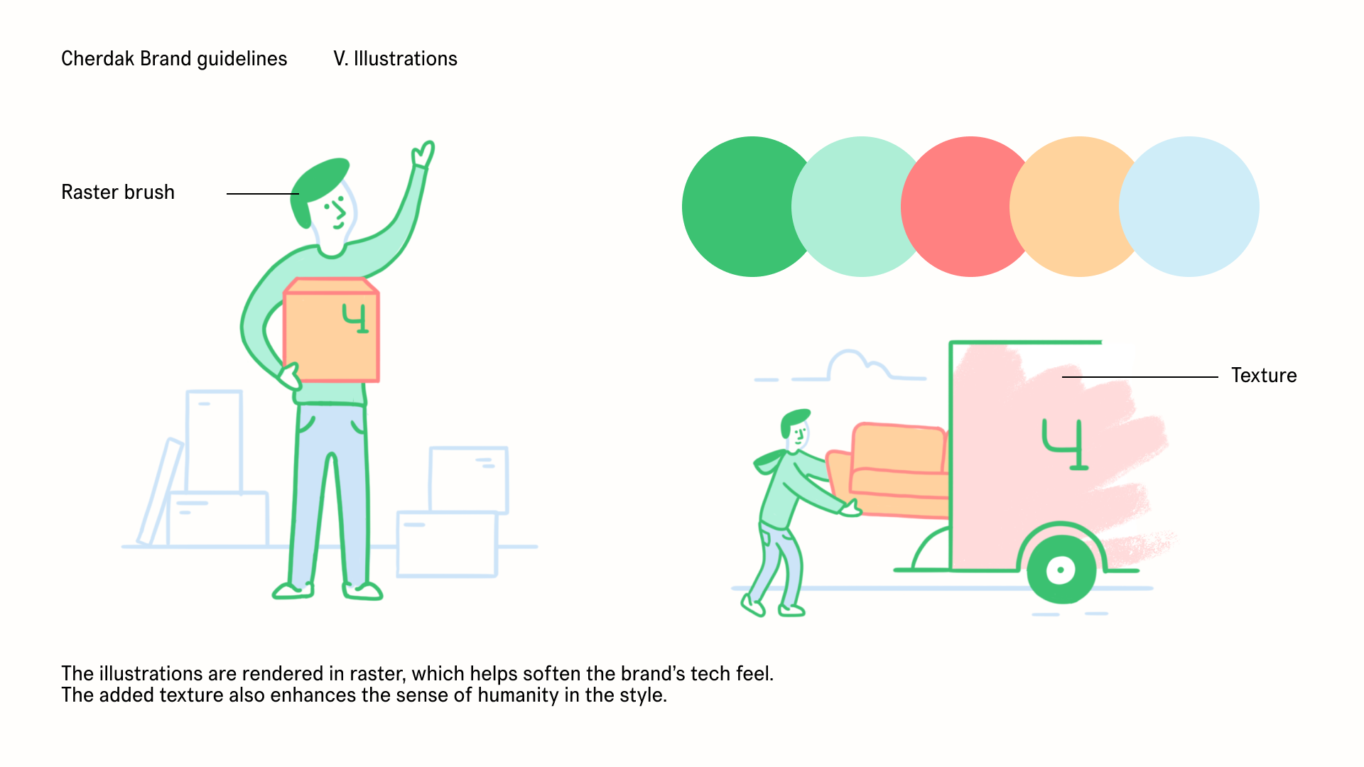
That’s where illustration came in. Besides handling visual communication in a functional way, the illustration style played a bigger role: it helped soften the overly “techy” feel of the service and made the brand more relatable and human.
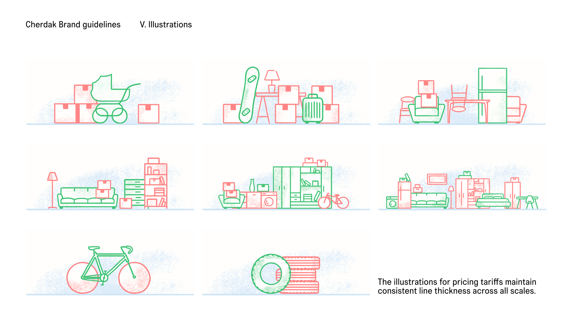
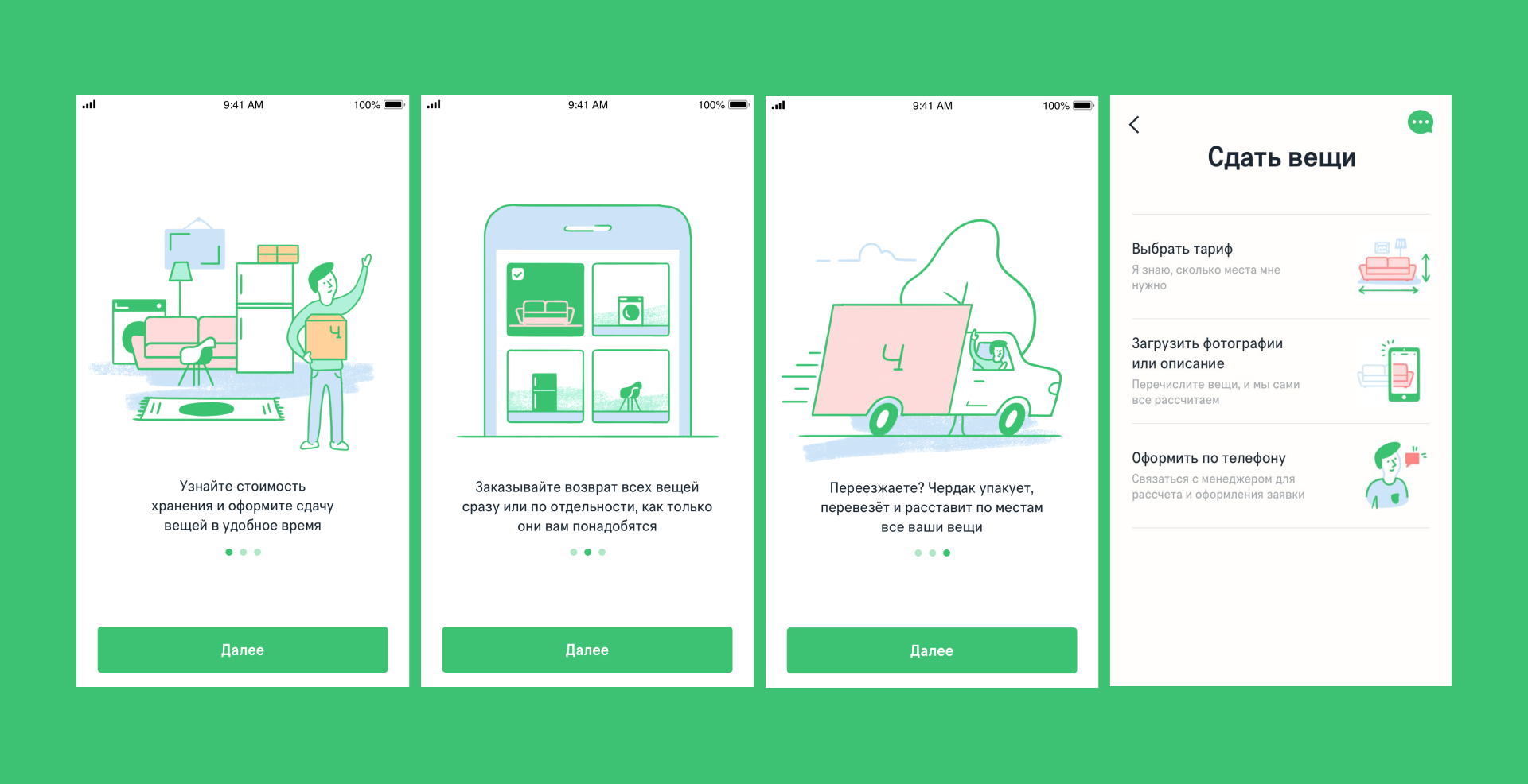
I made sure the illustrations blended naturally into the brand by sticking to the core color palette, but the style itself has a hand-crafted texture that adds warmth, depth, and a bit of personality. They’re used throughout the product, for visualizing pricing tariffs, onboarding flows in the app, and explaining how the service works on the website. They’re not the main visual, but they support the overall communication in a subtle, thoughtful way.
Sure, these illustrations could’ve been purely functional. But it was the illustrations that really helped create a trustworthy impression of the service. And that, in the end, is what mattered most to the user. I’m a strong believer in user-centered design, and sometimes, the right illustration style can be exactly what’s needed to build that sense of trust.